Layout Grid in Figma
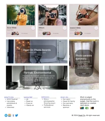
Let's create a section of the site in Figma like this:

Now we need to make it adaptive. Let's take a closer look at how we can achieve this. Let's start with the cards. In the article Constraints (Binding constraints) we have already studied card binding.
We set up our six cards in the same way. As we remember, we need to bind our cards to their parent - the main frame.
But how do we do this so that everything is adaptive and correct?
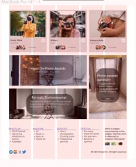
This is exactly where the grid system (Layout grid) comes to our aid. Click on "+" and add a Layout grid. Select columns (Columns). Set the indent (Margin) based on the indent on the website page.
We can already see that 5 columns are perfect for the footer:

Each information column is where it should be. But this grid system is not quite suitable for the rest of the content. Here we need to think a little, and most likely there should be six columns at the top.
What can we do?
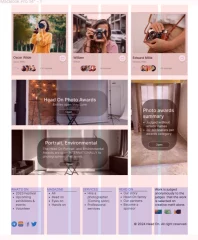
Our footer is on a separate frame. So, let's change the number of columns to six, and add a new column system to the footer frame. To make it easier to see and not get confused, let's change the color of the columns to blue:

Now we will bind the top three cards - left, top, right. They will be bound to the edges of the columns, this is exactly what we need.
We will do the same for the bottom two cards and the side one.
First, we will bind each column separately to the left edge and top of the footer, and then their parent frame - left, bottom, right.
Copyright sign - bottom and right.
That's it, we have set up the bindings to the grid system as needed, and our site page is now adaptive.
