
Fill in Adobe Illustrator
By default, the object color in Adobe Illustrator is white, and the stroke color is black. You can change the color of the object by double-clicking on the fill color in the toolbar. A palette will open in which you can generate any color. Working with the color scale and moving the indicator along the palette, you will select the color you need.
Note that after you have selected a color, some numbers and percentages will appear on the right.
What is this?
This shows the selected color in digital values and in different color models. Here the value of your colors will be broken down into channels.
For example, the first color model is this is HSB, Hue channels - color tone, Saturation - saturation, Brightness - lightness.
The same with the CMYK and RGB models. You can also see the color you have chosen as a code, which is very convenient when you need to, for example, transfer the color to another person. To do this, simply copy this code and transfer it.
Fix the Color palette on the right side of your work panel. By default, it can be collapsed. To expand it, use the Show Options command.
In the Color palette, you work exclusively by channels. For example, if you have the CMYK palette selected, there will be 4 channels:
C – cyan (blue)
M – magenta (purple)
Y – yellow
K – black
When you work by channels, it is very convenient to make fine-tuning of the color. And it is also very convenient to literally clean out the color when preparing for printing.
Let's say you need to print a green object. You've created a green object, looked at the channels and seen that you've used all the colors in the CMYK palette.
But do you need them all to create a similar color?
I don't think so, 3 channels are enough. The fewer colors used in the printing process, the more economical it is. And for us, as designers and illustrators, the important thing is that the color from the printing press will be much purer.
This method of fine-tuning color is more relevant for printing.
Printing – this process is very imperfect and capricious. That is why there is such a profession as a prepress engineer.
If you create an illustration or design for the web in Adobe Illustrator - this whole process can be omitted. In this case, adjust the color as you like and as is easier for you.
In addition to the CMYK palette, you can also work in other palettes.
Grayscale is perfect if you work with shades of gray. It is convenient to work with one channel instead of 3-4.
RGB – traditional palette for the web.
HSB is a more universal palette.
You can use any palette that is convenient for you to work in.
If you created a project in the CMYK color model, and edit colors in the RGB palette, this does not mean that you change the color space of your project.
Your project will remain in the color model that you specified when creating the document. You can just work in any other palette. This was created solely for convenience.
If you imagine that you are preparing a project for the web, and you are used to working with CMYK channels. Most likely, you will use 2-3 palettes in your work, for example CMYK, RGB and Grayscale.
You can create new Adobe Illustrator documents in two color models - CMYK and RGB.
CMYK is a color model for print projects.
RGB is a color model for web projects.
Why did they create two different color models for us for the web and for printing?
The fact is that the RGB color model has a much larger gamut, it supports a larger number of colors, while CMYK supports significantly fewer colors.
CMYK will not be able to reproduce any extremely saturated and poisonous colors. This is due to the technical limitations the printing equipment and the features of chemical pigment bonds of paint. Printing equipment (even the most advanced) is not yet capable of giving us any color we want.
And that is why, already when creating a layout, you need to use the CMYK color model, thereby limiting your color space so that your printing machine can handle the print. So that the color that the printing machine produces is immediately visible on the computer screen when working with the layout. This is an obligatory element of your work as a designer.
Let's get back to the fill. In Adobe Illustrator there is such a tool - Color Guide. Find it in the Window menu and pin it to the panel under the Color palette.
In the Color Guide palette, you can search for different color harmonies and create your own palettes. In addition to the fact that Adobe Illustrator will offer you several basic colors, you will have access to an extended menu where you can choose more subtle shades.
These shades will differ in saturation and lightness. You can also change the colors from the harmony offered to you, after which the harmony will change based on the new color.
This way, you can create your own unique palettes.
It is very convenient to combine in the Color palette and Color Guide by expanding the side menu where you will see in real time how when changing the color in the Color palette, the harmony colors in the Color Guide will change.

You can save the harmony color by clicking on the icon in the lower right corner of the Color Guide palette. After that, this color will appear in your Swatches palette. You can find it in the dynamic panel or in the Window and pin it to the work panel on the right.
Now let's talk about an equally important tool - the Recolor Artwork palette. 
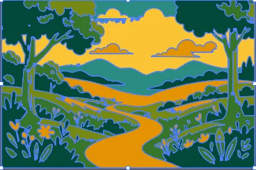
Let's say you're working with an illustration:
To change any of the colors, you can use the Color Guide or the Color palette. You can change the color by channels, or you can use the Color Picker tool.
In the Recolor Artwork palette, you will see all the colors used in the drawing within the color wheel. The further the color is to the edges of the circle, the more saturated it is, and the closer to the center, the less saturated it is. Pay attention to the "lock":

If you hold down any color and start moving it, all the colors will start moving at once. This way you can quickly change the palette of the entire drawing at once.
The saturation of each color can be edited separately or all at once by dragging the largest circle in the palette. To move colors separately within the color wheel, you need to remove the "lock".
You can also change them by double-clicking on the color icon and create (delete) new ones. In the Color Library section you can find interesting color presets, but the most interesting feature in this palette is the Color Time Picker.
What does it do?
It literally copies palettes from vector and even raster images.
Open absolutely any image and place it on the workspace. Select your illustration and in Recolor Artwork select Color Time Picker and click on the image. If you click on any object or group of objects, their color will be applied to your illustration.
In addition, you can click on single or grouped objects, defining the area of color reading. To do this, you do not need to click on the objects, but select them with LASSO, the same tool.
If, for example, you liked the colors in a particular part of the illustration, then you can easily use them specifically, without mixing them with other colors in the picture.
In the case of a raster image, the colors are removed from the entire picture in any case, that is, it does not matter at all which part of the illustration you will select LASSO or where you click with the eyedropper.
In the Prominent Colors palette, you can increase or decrease the brightness and saturation of a color in a drawing by holding its border on the color scale and pulling its edge to the side.