Constraints in Figma
Constraints - in our opinion, "constraints", but everyone calls this function "binding". That is, we bind an object to its parent in a certain relationship.
Constraints works exclusively inside a frame. All layers inside a frame must be organized as correctly and accurately as possible, otherwise Constraints will not work correctly.
Therefore, always pay attention to the organization of layers inside the frame to which you are going to apply Constraints.
Let's analyze the settings Constraints.
"Sight" - snap an object to the top, bottom, right, left, or center.
If you hold down Shift, you can snap to several sides at once.
For example, with the "top and left" settings, the object will always tend to be at exactly this distance from the edges of its parent frame.
That is, with any change in the width or height of the parent frame, the object will tend to move along with the edges of its frame.
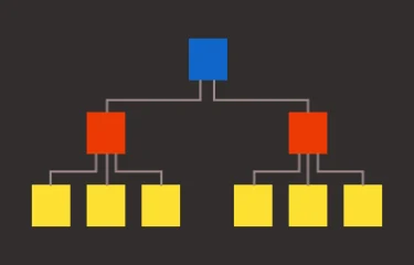
Here is a diagram that will help you understand Constraints:

Small objects are in larger frames, and larger frames are in even larger frames, and so on up the hierarchy.
Accordingly, when you start working with bindings, you need to start from the very bottom.
That is, first set up all the bindings inside the small frames, then bind the medium ones relative to their parents, and so on in ascending order, no matter how much nesting you have inside the work.
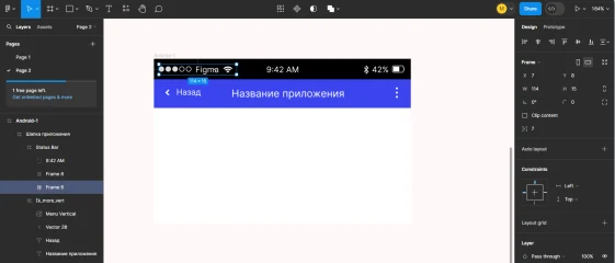
Here is an example of setting up the "status bar" on a mobile phone:

In the "sixth frame" we have the elements highlighted in the picture. We bind them relative to this frame: to the left and up.
We bind the "sixth frame" itself to its parent "Status Bar" also to the left and up.
We bind the next element, the "text layer with time", to the top and center.
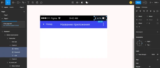
Next, let's look at the "eighth frame". In it we have "bluetooth sign, battery percentage and battery".

We tie them up and to the right. We also tie the "eighth frame" up and to the right relative to the "Status Bar".
We tie the "Status Bar" to the "Application Header": up, left and right. We also tie the "Application Header" up, left and right.
We tie the "Application Name" up and to the center and set the text settings to the center. (Align center and Align middle). To ensure that the text wraps normally down when the layout is reduced, you can also increase the text block itself up and down.
The "Back" text and "arrow" are bound up and to the left, and the "three-dot menu" - up and to the right. Ik_more_vert - up, left and right.
That's it, now we can select our Android and drag it, the layout will be adaptive.
What's the beauty of Constraints?
It's that you can very quickly create adaptive layouts of your design.
In fact, the Constraints function is more intended for mobile development. That is, for creating mobile applications, because we have a huge number of different devices with completely different resolutions.
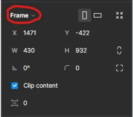
You can see how your design will look on different mobile devices:

Click on the drop-down list and substitute any layout.
