
Ability to distinguish colors
Why is it Important for a Designer to Distinguish Colors
Color in design is not just decoration. It creates mood, controls attention, and influences product perception. The ability to distinguish even the most subtle shades helps a designer create harmonious layouts in which colors work for the result, and do not interfere with each other.
Color combinations and the psychology of perception
Each color combination evokes certain emotions. For example, blue is associated with calm and trust, red with energy and action, green with nature and balance.
In design, it is important not only to choose the right shades, but also to take into account the cultural features of perception. Mistakes in color combinations can make a project visually “heavy” or alienate the user.
Accuracy of color perception as a designer skill
A good designer can distinguish cold blue from warm, notice subtle transitions in gradients and find the perfect balance between accent and background colors. This skill is especially valuable in web design, branding, illustration and printing, where color plays a key role.
Online Color IQ Test
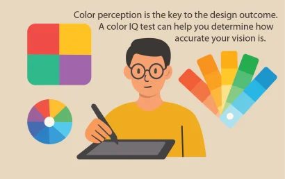
You can check how well you distinguish colors using special tools. One of the most interesting ways is the color IQ test. It allows you to evaluate the accuracy of perception and understand how developed your sense of color is. This is especially useful for designers, illustrators and anyone who works with visual information.
👉 Want to test your perception? Take the online color IQ test and find out how high your level of working with shades is.